
Color Theory: An essential guide to color-from basic principles to practical applications

Color is the soul of art. It shapes how we perceive and feel about what we see. Whether you’re drawn to the vibrancy of Van Gogh’s Starry Night or the soothing tones of a Japanese woodblock print, color holds the power to captivate and communicate emotions. But to truly master its use, understanding color theory is essential. Let’s embark on a colorful journey, exploring its principles and the ways it transforms art into a language of its own.
What Is Color Theory?
At its core, color theory is the science and art of using color. It’s about understanding how colors interact, how they affect our emotions, and how to combine them effectively. Think of it as a roadmap for your creative process, guiding you through the complexities of hue, value, and saturation.
Hue refers to the name of a color (red, blue, yellow).
Value measures a color’s lightness or darkness.
Saturation speaks to a color’s intensity or purity.
These elements form the foundation of color theory, shaping how we create harmony, contrast, and mood in our work.
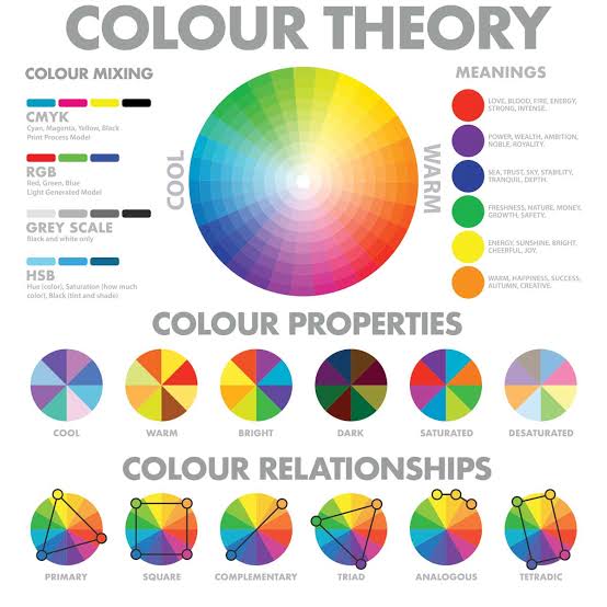
The Color Wheel: Your Artistic Compass
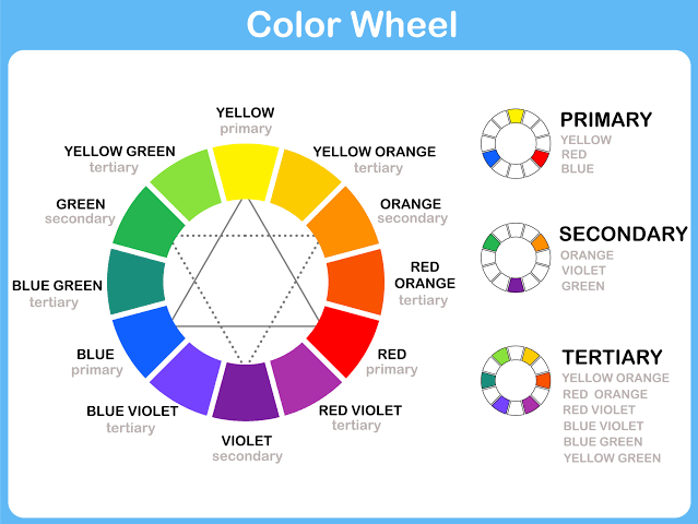
The color wheel, first conceptualized by Sir Isaac Newton, is a circular chart that organizes colors by their relationships. If you’ve ever spun one in an art class, you know how mesmerizing it is!
- Primary Colors: Red, blue, and yellow—the building blocks of all other colors.
- Secondary Colors: Orange, green, and purple, created by mixing primary colors.
- Tertiary Colors: A blend of primary and secondary colors, like yellow-green or blue-violet.
Imagine you’re painting a serene forest. By pairing yellow-green leaves with a deep blue-violet sky, you instantly create contrast and depth. The color wheel helps you make choices that breathe life into your vision.
Color Harmonies: Finding Balance
Artists often talk about harmony in art, and color is central to achieving it. Let’s dive into some of the most common harmonies:
Complementary Colors: Opposites on the color wheel, like red and green or blue and orange. Using them together creates striking contrasts that make elements pop. Picture a sunset where orange clouds are reflected on deep blue water—breathtaking, isn’t it?
Analogous Colors: Neighbors on the wheel, such as yellow, yellow-green, and green. These combinations are soothing and often found in nature, like the gentle gradient of leaves in sunlight.
Triadic Colors: Equidistant hues, like red, blue, and yellow, create vibrant and balanced palettes. Think of traditional folk art, where bold triadic schemes add energy and joy.
Monochromatic Colors: Variations of a single hue. This scheme evokes elegance and simplicity, like the peaceful blues of a twilight sky.
Cultural Nuances in Color
Color meanings are deeply rooted in culture. Understanding these associations adds layers of depth to your work.
Red symbolizes luck and celebration in Chinese culture but can signal danger or passion in Western contexts.
White signifies purity in many parts of the world but represents mourning in India and Japan.
Blue often evokes calmness but can also represent sadness, as in the phrase “feeling blue.”
When creating art, consider your audience. If you’re designing a piece for a global exhibition, exploring these nuances can make your work resonate universally.
Emotions Through Color
Color is a master of emotions. Warm colors like red, orange, and yellow bring energy and excitement, while cool tones like blue and green soothe and calm.
Example:
Claude Monet’s Water Lilies is a study in cool colors. The greens and blues wash over you like a gentle breeze, creating a sense of tranquility. In contrast, Mark Rothko’s fiery red and orange paintings stir a visceral intensity, drawing you into their heat.
Personal Insight:
I once painted a mural for a community space. Choosing bright yellows and oranges for the central design was deliberate—it brought warmth and vibrancy to the room, encouraging connection and conversation.
Practical Tips for Mastering Color Theory
- Start with a Limited Palette: If you’re overwhelmed, begin with just a few colors. Experiment with mixing them to create variations.
- Observe Nature: The natural world is the best teacher. Study how colors work together in a sunset or a blooming garden.
- Use Color Swatches: Many artists swear by creating swatches to test combinations before committing to a piece.
- Experiment with Light and Shadow: Adjusting the value of colors adds dimension and mood to your work.
Resources to Deepen Your Understanding
Books:
Color and Light: A Guide for the Realist Painter by James Gurney.
Interaction of Color by Josef Albers.
Courses:
Check out platforms like Skillshare or Coursera for courses on color theory.
The Museum of Modern Art (MoMA) often offers online art courses, including modules on color.
Digital Tools:
Use apps like Adobe Color to experiment with palettes and harmonies digitally.
The Journey of Color
Understanding color theory is like learning a new language—challenging at first, but infinitely rewarding. As you explore, you’ll find that color isn’t just about aesthetics; it’s about storytelling, emotion, and connection.
So the next time you pick up your brush or pencil, think of the hues as characters in your story. Let them interact, clash, and harmonize. Because when you master color theory, you’re not just making art—you’re creating experiences that linger in the hearts of those who see them.
What will your next masterpiece say?
